
Le tendenze colore primavera 2016 nell’interior design
Stamattina, leggendo un articolo sul sito di Dalani che racconta delle tendenze colore primavera 2016 nel settore arredamento (lo potete leggere qui), mi è venuta voglia di scrivere questo post per parlare della palette cromatica a cui quest’anno si ispirerà il lavoro di molti architetti e interior designer nonché del fashion system e del mondo della creatività in generale. Come sostiene il celebre sito, che propone arredi e complementi d’arredo delle migliori marche a prezzi speciali, nel 2016 le nostre abitazioni si vestiranno di due nuove nuance: il Serenity e il Rose Quartz. A decretarlo è il Pantone Color Institute, autorità del settore, che le ha nominate Color of the Year. Il Serenity, un blu celeste con i riflessi del lilla e il Rose Quartz, un rosa cipria un po’ più caldo, risponderebbero alla ricerca di benessere che caratterizza l’uomo moderno. E per benessere intendiamo la pace, la tranquillità e l’equilibrio in contrapposizione alla frenesia, follia e mancanza di punti di riferimento propri della società in cui viviamo.
This morning the reading of an article published on the Dalani website on the Spring 2016 color trends in the furniture industry made me want to write this post about the color palette that will influence the work of many architects and interior designers in the next months.
As claimed by the famous site, which offers furniture and home accessories from the best brands at special prices, in 2016 our homes will dress two new colors: Serenity and Rose Quartz, the two shades named as “Color of the Year” by the Pantone Color Institute, an authority in this area. Serenity, a heavenly blue with reflections of lilac and Rose Quartz, a pale pink, would be an answer to the insistent demand for greater well-being by the contemporary society. And for well-being I mean the peace, tranquility and balance in contrast to the frenzy, madness and lack of landmarks of the world in which we live in.

La casa si trasforma in un nido capace di proteggerci dal mondo esterno, in cui trovare serenità e calore. E’ il luogo della fiducia, della famiglia e degli amici; di tutto ciò che non temiamo e che ci fa stare bene. Mobili, muri, pavimenti si rivestono di sfumature delicate che non affaticano i sensi, ma li tranquillizzano: tonalità pastello, bianco, legni chiari che si mixano in totale armonia con altre palette. Toni medi, compresi verdi e viola, marrone e tutte le sfumature del giallo e del rosa. Con spazzi di oro e argento per un tocco shiny.
The house is transformed into a nest able to protect us from the outside world, is the place of trust, family and friends; of all the things that make us feel good. Furniture, walls, floors are covered with delicate nuances that calmed the senses: pastel shades, white, pale woods mixed in harmony with other palettes. Midtones, including green and purple, brown and all the shades of yellow and pink.
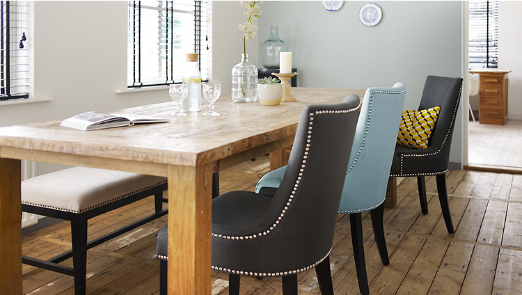
Se il 2015 è stato l’anno del marsala, nelle tendenze colore primavera 2016 irrompe il più discreto e goloso pesca, una nuance che emana calore e disponibilità, adatta soprattutto per i tessili. Poi, sempre scorrendo le foto su Dalani, ci sono l’azzurro cielo e il tortora (una specie di grigio tendente al lilla) già molto usato negli ultimi anni sia in ambito moda che arredamento. Quindi, l’Iced Coffee altro colore neutro per eccellenza dalla indiscussa eleganza.
If the 2015 was the year of marsala, in 2016 the year of natural colors such as peach breaks, a shade that exudes warmth and friendship suitable especially for textiles. Then, always looking at the pictures on Dalani, there are the Limpet Shell (light blue) and the Lilac Grey (a kind of gray tending to purple) already widely used in recent years both in fashion and furniture. Then we have the Iced Coffee another neutral and very elegant color.

Last but not least ecco le tonalità più vivaci della prossima primavera, che portano brio ma sempre senza esagerare. Sono il verde brillante, sinonimo di natura e spirito green, il giallo limone, tipico delle giornate d’estate e simbolo di felicità, il fiesta (un rosso chiaro), volto passionale di questa palette e infine lo snorkel blu che ricorda le intense sfumature dei fondali marini.
Last but not least, here are the most vibrant shades of the next 2016 Spring, that brings liveliness but always without exaggeration. They are the bright green, synonymous with nature and green philosophy, the yellow lemon, typical of summer days and a symbol of happiness, the fiesta (a light red), the passionate face of this palette and finally the snorkel blue that recalls the seabed deep hues.


Una palette di colori rassicuranti, dunque quella proposta da Pantone, capace di sottolineare quella rinata e rassicurante ricerca da parte dell’individuo di una maggiore autenticità e di un ritorno ai valori più genuini dell’esistenza e che, alla luce dei tristi fatti di attualità di cui sono zeppi quotidianamente i nostri telegiornali e siti di news, può essere anche interpretata come un augurio affinché pace e serenità non finiscano solo sui nostri capi di abbigliamento e arredi, come semplice trend di stagione, ma possano in un futuro non lontano colorare indelebilmente il mondo che ci circonda.
Finally one last thought. In the light of the sad current events that fill our daily newscasts and news sites, I hope that the palette of shades proposed by Pantone contributes to color with its peace and tranquility also the world that surrounds us.
IF YOU WANT TO READ MORE
Realtà aumentata: inizia l’era hi-tech dell’arredo
Profumi Jean Paul Gaultier, ecco il video del Fragrance Talk #JPGBarbican
I Coloniali @ Salone del Mobile 2013
FOLLOW ME ON


mi fa piacere vedere tanto azzurro…dato che la mia casa è quasi tutta azzurra 😀
Adoro i colori della prossima stagione e che belle le proposte Dalani!!!
Un bacio Lorena!
TruccatiConEva
favolose queste stanze, i due nuovi colori li amo già
buon mercoledì
<<< tr3ndygirl fashion blog >>>
Hola, me encanta esta tendencia, saludos.
Mi piacciono queste proposte per la casa, a volte basta poco, dei cuscini, un tappetto.
Baci
http://www.mammachefashion.com
che stanze divine
buon martedì
<<< tr3ndygirl fashion blog >>>
Quando ho scritto il post su Pantone, soffermandomi su abiti e tendenze dell’abbigliamento, non ho minimamente pensato che ci sarebbero stati riflessi anche nell’arredamento…..che stupida che sono! Ottimo questo post. Ci sono delle idee fantastiche che potrò mettere in pratica….Un bacio e grazie della tua visita,
Eni
Eniwhere Fashion
Bloglovin of Eniwhere Fashion
che meraviglia!
http://emiliasalentoeffettomoda.com/laboratori-di-cucina-per-bambini/
grazie
Mari
Bellissime queste idee, mi piacciono molto i colori!
Bella Pummarola
idee stupende dai colori meravigliosi a presto cara
(http://ilfilodiarianna13.blogspot.com)